Scott's United Cigar's hoax exposed !
3 posters
Page 1 of 1
 Scott's United Cigar's hoax exposed !
http://cgi.ebay.com/T206-SCHLEI-WITH-RARE-UNITED-CIGARS-AD-BACK_W0QQitemZ150293183591
More detail from Kevin:
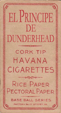
"I received the card today and gave it a very thorough inspection, spending about an hour on it. It is more than obvious that that cigar logo print is under the Sweet Caporal printing. I can go one step further and say that the print is well under the Sweet Cap. I use the term print because it does not seem to be a stamp. If you take a very close picture at an extreme angle you may be able to display it more accurately.


ItsOnlyGil- Retired

- Posts : 1145
Trader Points :


 Re: Scott's United Cigar's hoax exposed !
I actually decided to read some of that thread. I have no clue whether it's legit or not. Although from the pictures presented by Kevin, it look like the United Cigar was printed first, Frank Ward made an interesting observation about the way ink acts when you trying to put wet ink over dry ink. It makes sense to a certain degree but if you look at other t206s with over prints of different brands, it's very obvious which was printed first, etc. So this doesn't fully explain what is going on with card. My thought too on Frank's observation is that is it was printed after the SC, there should at least be a few spots of black on the red ink.
the other good chuckle I get is people lording Old Put overprints as legit. I'm still trying to get Kevin to try his hand at faking this. The Old Put logo is very plain. All you need to do is go to a scrapbooking or stamping store and get one custom made. Get some purple ink and you have a very cheap making making machine.
Jay
 Re: Scott's United Cigar's hoax exposed !
Well it's not a hoax as it belonged to others before him with the same marking.
While it's true, that a stamp will soak in and have the look that part of it is under the print. Most of the time a stamp will be blotchy and well, look like the card was stamped.
The Cigar logo has a nice even deep ink layer and tone where there is no paper loss, different then the typical inconsistent ink from a stamp. IMO it looks like someone (for some reason) ran the Cigar logo though the printer first, then ran an ordinary Sweet Cap print over it. If these are two independent prints runs, this would give a possible explanation why the paper loss removed the Sweet Cap part but not the cigar logo under it. Although there is still some minor paper loss on the logo.
Also keep in mind United Cigar Store was doing mass marketing during that time and made countless coupons inserted into tobacco products that could be redeemed for prizes. Maybe this was a failed attempt or an idea that just didn't fly...who knows.
As I've said before, if I'm wrong, well it wouldn't be the first and for sure won't be the last. I'm just honored that collectors from all over the country have come to trust my opinion.
Jay...I'm dying to make an Old Put stamp. I'm with you, quite sure it will look authentic if the fonts and ink are correct.
Kevin Saucier
Page 1 of 1
Permissions in this forum:
You cannot reply to topics in this forum

